First off, the tutorial. I'm gonna show you how to customize digital scrapbook items to fit your needs! All of my stuff is done in Photoshop CS5. I'm going to be using a piece of background paper that looks like wood from the kit "Working Overtime" by MT Lane Designs. Apparently she no longer has a blog so I will link to the image in my own photobucket. Save it and use it to go along with me in the tutorial if you like.
*note: I always start off with a new document 12x12 inches at 300 dpi
I wanted the wood background, but I needed it in different proportions and in a different color. Here's what I did: (Click the photos to see larger image)


Now create a new layer


Change that layer's blending mode to Multiply.

Now for the final customization! Click on your desaturated wood layer. Go to Image>Adjustments>Brightness/Contrast


Thanks for stopping by! This was my first tutorial so let me know if I can clear anything up. And don't forget to visit my SITE!
Original file:

First, I transformed the image to make skinnier wood planks. To transform an image, go to Edit>Transform>Free Transform and drag the points however you desire. Here's a tip - holding down SHIFT while dragging a corner point keeps the image's proportions. I did not want to keep the proportions so I simply 'squished' the image.

Next, I duplicated the layer.

Now I have 2 layers of the same image. Move one of these layers so that the last and first planks of wood overlap (this way you still get the dark line dividing the planks in all the right places). I highlighted my second layer green so you can see where I moved it.

Now, for that layer you just moved, you're gonna want to mess with it so it doesn't look like a repeating pattern. All I did was rotated it 180 degrees.

Repeat the duplicating and rotating until your page is filled. Here's what it looks like now

You're going to want to merge the layers together so it's just one image again. Select the layers by holding down control (PC) or command (Mac) and clicking on the layers. Right click then click Merge Layers
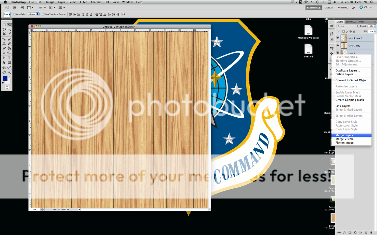
Now we're going to work on recoloring it. There are a thousand ways to go about doing this. Here's how I did it:
Desaturate the image to turn it to grayscale
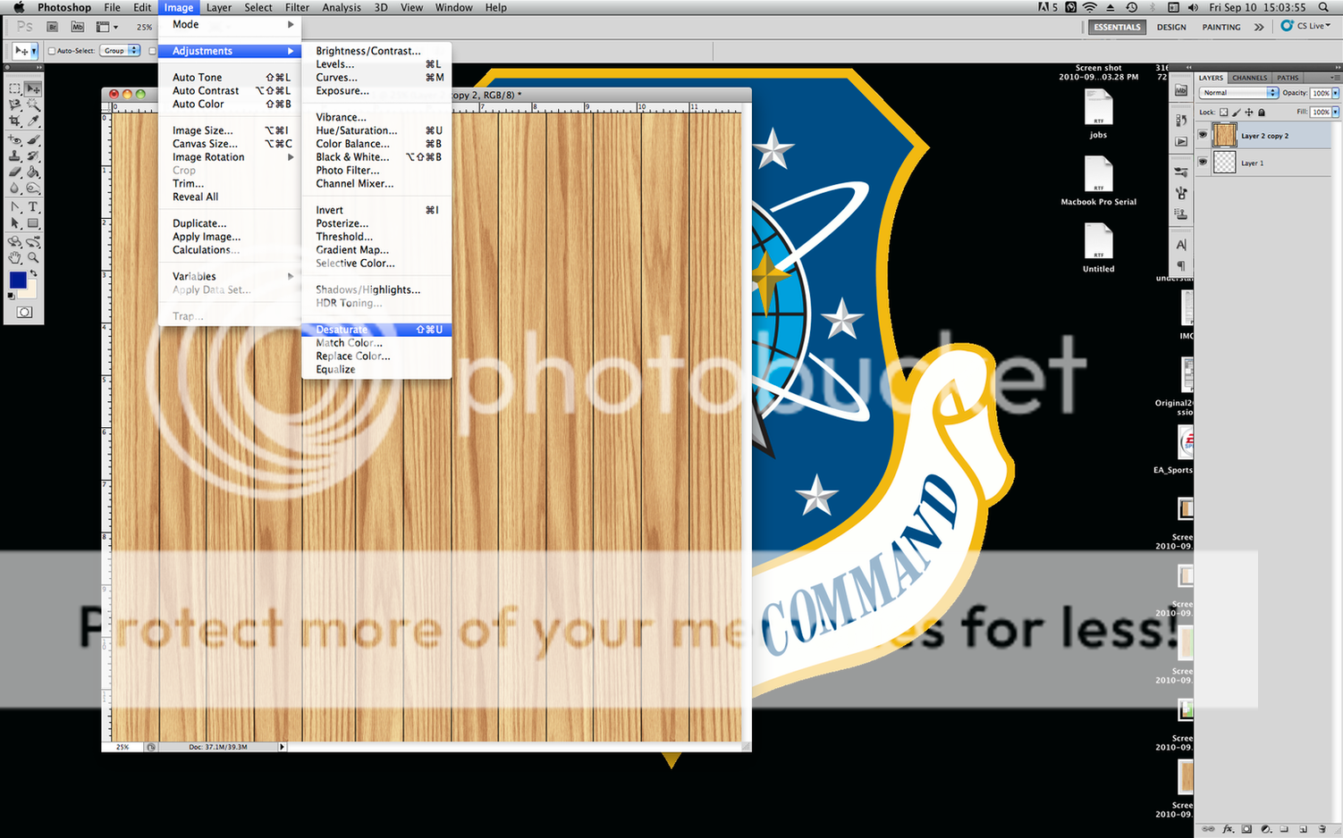
Now create a new layer
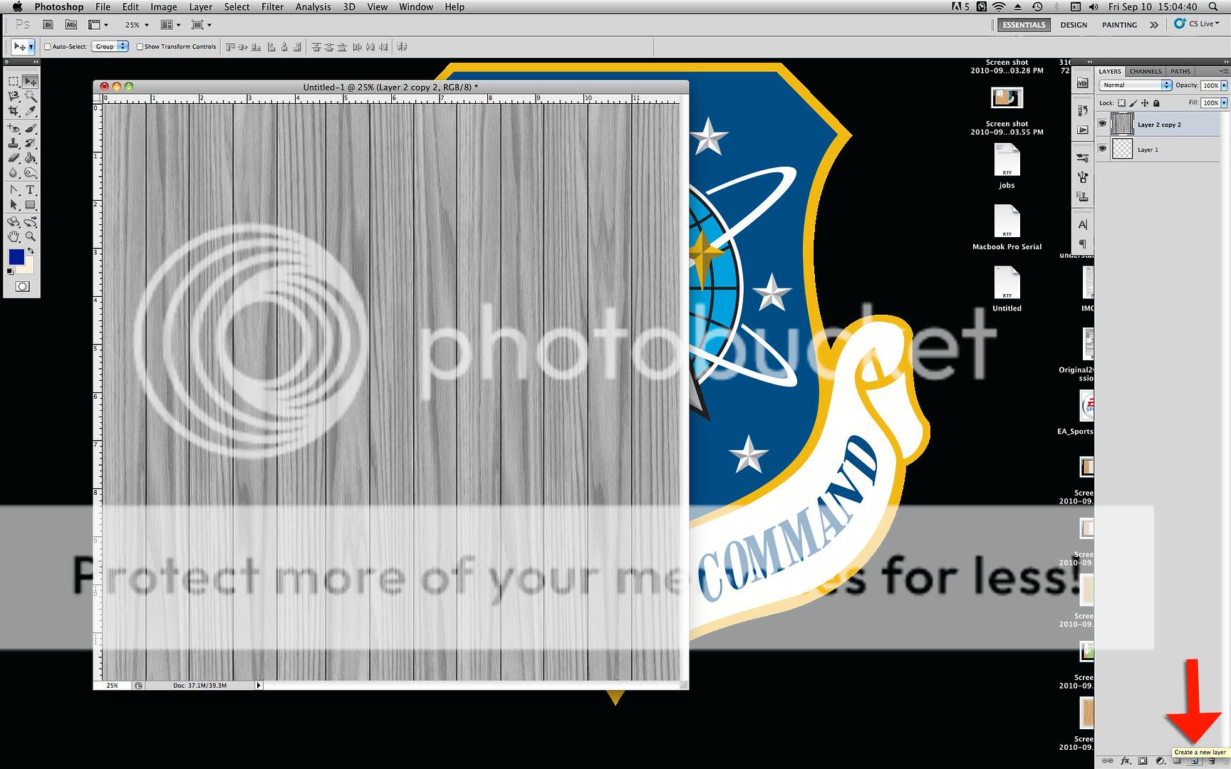
Fill that layer with a color close to what you want the wood to be

Change that layer's blending mode to Multiply.

Here's what I got:

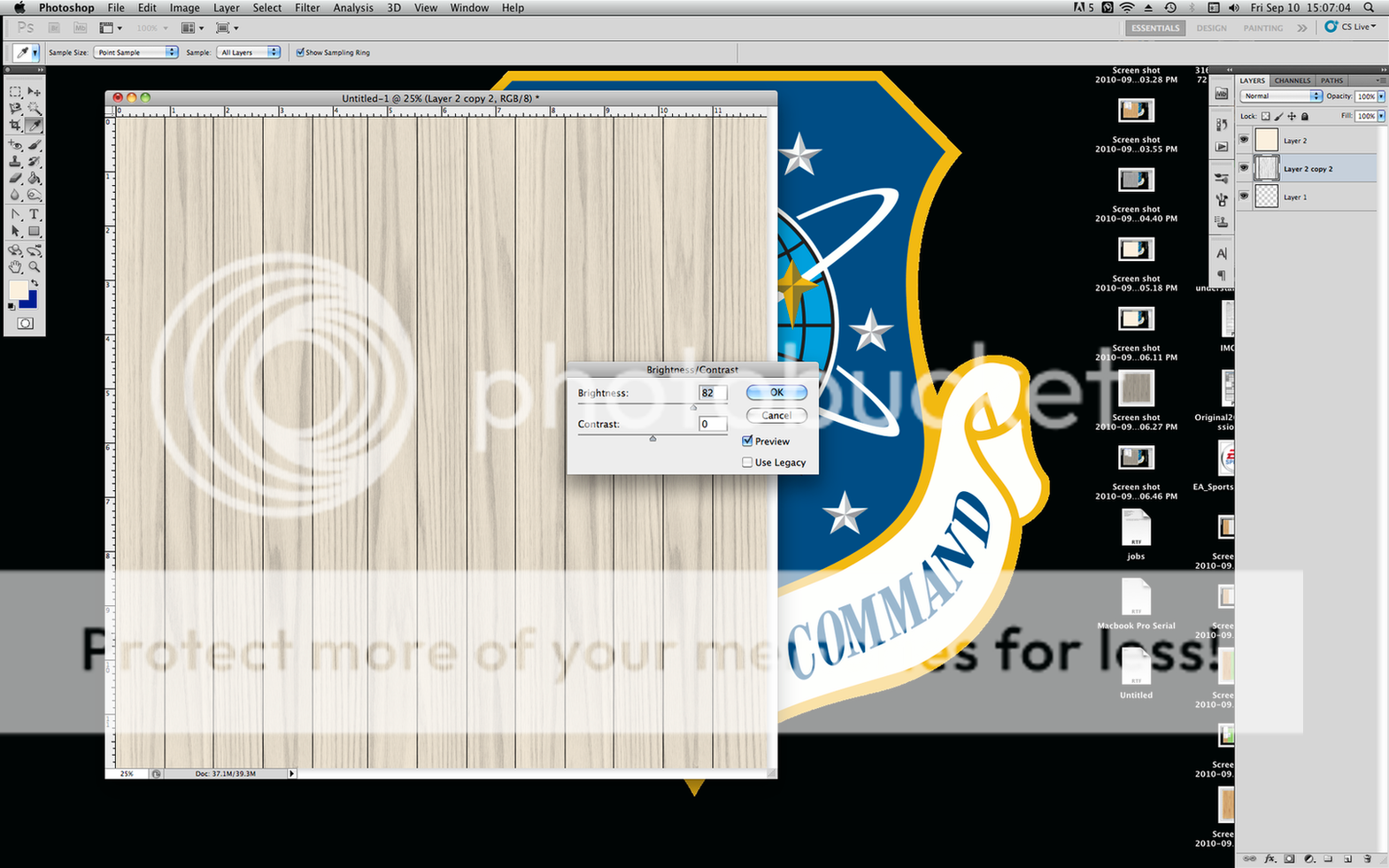
Now for the final customization! Click on your desaturated wood layer. Go to Image>Adjustments>Brightness/Contrast

Play with the brightness until you get the final color you want.
Thanks for stopping by! This was my first tutorial so let me know if I can clear anything up. And don't forget to visit my SITE!
Now for my scrapbook pages. One of which uses this new and improved background paper. I'm not sure yet if I like the swimming pool one. I was in a 'just get it done' mood rather than a 'make it perfect' mood. You might be seeing a remake of that one in the future.


^credits:
background - Working Overtime by MT Lane Designs
clothespin - Americana by Ziggy Fan Scraps
string - Buddy Boy by CuddleBeez Scraps

^credits: Splash Kit by The Scrapping Sisters
clip - Daditude by Peppermint Creative
Linking to: